Follow the lines - Creativity Exercise | Photography Tips

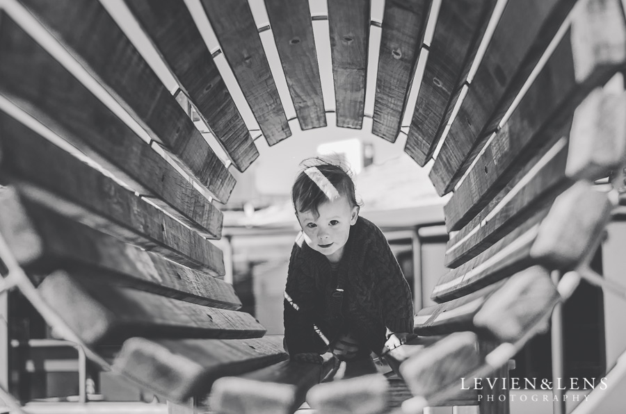
Did you ever put attention to lines on the pictures?

They draw your attention to the main subject, leading in composition, frame and play a big role in photography.

You can see a horizontal, vertical or diagonal and also all mix of these types. 

Creativity exercise today: Follow the lines!

Try to see different types of lines around, include them in the frame and draw attention to your main subject. Its could be leading lines in composition, horizontal/vertical/diagonal lines of surrounding objects or even body lines, arms etc. Even if you not notice lines too much, they are there. Try to incorporate all other sides of photography: watch the light, colours, composition etc. and have fun with post processing, twist the colours and create a black and white images if its speaks to you!

Look at couple of shots what I did today for this creativity exercise while my kids played at playground (when else can I find time for everyday shooting and my 365 Project :)

Contact me with any question!

Colour in photography. Photography tips. Lifestyle family and wedding photographer Auckland LEVIEN & LENS PHOTOGRAPHY

Did you ever think how important colour is in our life, what influence it have?

We are surrounding by different colours and each colour has a special meaning for us (some could be attractive, some warning).

For example, red colour - we know from childhood - red signal STOP, green GO! At the same moment red colour take attention and its colour of love, passion, intensive. A lot of companies choose red colour for their logo for take clients attention (look at big brands such as McDonalds, Coca-Cola and a lot of others. I don't know why I choose a food companies? Maybe I just hungry :) Actually some colours works good for food places, some great for offices and working environment, some good for creativity, and some perfect for calm down and relax places. If you put attention on this places you could see common colour palette in all of similar type places. Its just proved by practice, experience and researches colours (and just individual preferences as well :)

Psychologically proved blue is the most attractive colour for a lot of people (wisdom - calm colour. You love blue sky, water etc.). Green really nice as well - its a nature colour (trees, grass, fields etc.).

Its just some common information. Don't worry, I'm not going to move into details of each colour! Every person has their own colour palette and own preferences in clothes, choosing room colours, make-up, hair colour etc. Some scientist saying it comes from their eyes, skin and vein colours, its from birth lay into their personalities. But I think it also comes from personal experience and people around them. For example, mums often dress babies in colour palette what they like, and probably its has some influence.

Also important to know complementary colours (like red and green, for example), matching colours and how they work together (or not work at all :) Here for example my little one hiding in the garden (you can see green, red and blue main colours here):

child in the garden


How its related to photography? Its just base what each photographer need to know and put attention:

- colour palette for clients clothes (what matches together, what looks best at chosen location - near green trees, or blue ocean, or brown sand, or steel and glass architecture at city, grey concrete etc,). Its a lot of boards on Pinterest which have amazing colour palettes samples for couples and families with big amount of choices. So you no need to know every little detail about colour, you could just go with your feelings, choose which one you like more :)

- colour palette of surroundings at photo shoot (what colour cast around, is it give some not so nice tone for clients skin if you come closer to it, is this colour complement chosen client clothes, is surface give a lot reflection (natural, white, grey) or could be used like flag for limit and control amount of light (dark surfaces). Also really nice to include white/ grey surfaces not just for reflection and more light but also for easy correct white balance in post processing :)

Some colours allows to subject pop out, your eyes just naturally look at splash of colour! (here example with little one dressed in red at complementary environment colours):

child portrait


- colours for photographers clothes (maybe not many photographers think, what colour clothes they wear. I know it should be comfortable and fit in photo shoot ides (one style for beach session, another for wedding shoot), but if you think about it you can see we often choose neutral palette (I often go for white top for give more light reflection, or for black one (especially for weddings - you just can't wear white at this day :) and black looks more formal for me as well :). Here some fun example from my last wedding (my second photographer Sonja unexpected ask me to take a picture with me and a bride, probably I looks not so great after 9 hours shooting, ha-ha :)

wedding photographer


- colours in post processing ( its a huge theme, I just slightly touch it, because its a science - to choose editing colours, based on your personal taste, style and also go from your clients personality and preferences; use a tone course, TAT tool, split toning and so many other tools what give you Photoshop and Lightroom (its a hole world of colours and we all still explore all this opportunities!).

SO I hope you enjoy own touch of base colours and how they works in photography. I highly recommend to read a psychology related books about colours and also practice and play with different colours combinations in different environment and see what works and what not works. You never know if you never tried! :)

Ask me if you have any question!

Tell me more about what colours do you like and what do you think!

Thank you for staying with me :)